Sage Braun · 1 October 2026
Decoding User Interaction Patterns in Specialized Digital Platforms Through Advanced Visualization Techniques
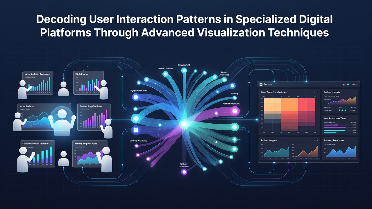
Specialized digital platforms generate vast amounts of interaction data each day, and visualization techniques turn those raw logs into clear maps of user behavior that teams can act on quickly. Researchers apply layered graphics such as force-directed graphs, sankey diagrams, and temporal heatmaps to surface sequences that simple click counts leave hidden, while platform operators in sectors ranging from enterprise software to educational tools use the same methods to refine navigation flows and content placement. Data collected across multiple regions shows that teams which adopt these visual layers reduce average task completion time by measurable margins compared with those relying solely on tabular reports.
Core Visualization Methods in Use Today
Analysts combine node-link diagrams with time-series overlays so that one view reveals both the structure of connections between features and the order in which users traverse them, and this dual perspective helps surface bottlenecks that appear only when sequence and context sit side by side. Color gradients scaled to dwell duration highlight areas of friction, while brushing and linking tools let observers filter an entire dashboard by cohort without rebuilding queries from scratch. Studies published through the IEEE VIS conference series document how these interactive layers improve pattern detection rates among analysts who review session recordings on a weekly basis.
Specialized platforms often host distinct user roles that follow different paths, and role-aware visualizations segment the same dataset automatically so that administrative workflows appear separate from end-user journeys. In October 2026, several mid-sized SaaS providers reported deploying these segmented views after routine platform audits revealed that generic dashboards masked role-specific drop-off points. The resulting adjustments to menu hierarchy and tooltip placement produced measurable lifts in feature adoption tracked through the same visual tools.
Implementation Across Platform Types
Educational platforms apply sequence sunburst charts to map how learners move between modules, and the radial layout makes prerequisite relationships visible at a glance while still preserving completion timestamps along each arc. Enterprise collaboration tools instead lean on clustered force graphs that group frequent co-editing pairs, allowing administrators to spot teams whose interaction density deviates from established baselines. Observers note that both approaches rely on the same underlying data model yet surface different insights because the visual encoding matches the dominant activity type of each domain.
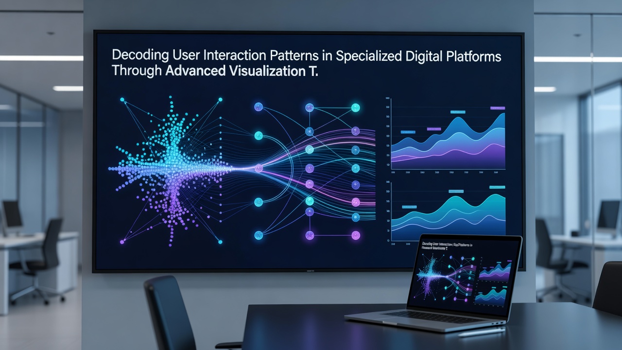
Healthcare scheduling systems add geographic layers to interaction timelines so that appointment booking patterns appear alongside regional demand spikes, and this spatial-temporal fusion helps operations teams anticipate peak loads weeks ahead. Government digital service portals in Canada have published open datasets that demonstrate similar layered mapping of citizen navigation trails, confirming that the same techniques scale from commercial to public-sector environments without requiring custom codebases.
Technical Pipeline and Data Handling
Raw event streams first pass through aggregation engines that normalize timestamps and assign session boundaries, after which dimensionality reduction steps such as t-SNE or UMAP project high-cardinality feature spaces into two or three dimensions suitable for screen display. The resulting coordinates feed directly into WebGL-rendered canvases that maintain 60 frames per second even when datasets exceed several million points, and these performance characteristics matter because analysts expect fluid exploration rather than static snapshots. Integration with existing business-intelligence stacks occurs through standardized export formats that preserve both the visual state and the underlying filters applied at the moment of export.
Security considerations surface when visualization systems retain full session traces, and platform architects address this by enforcing row-level access controls that strip personally identifiable fields before any graphic renders. Audit logs track which users viewed which filtered subsets, satisfying compliance requirements while still permitting the pattern discovery work that justifies the visualization investment in the first place.
Conclusion
Advanced visualization techniques continue to convert interaction logs from specialized digital platforms into actionable maps that teams consult during design reviews and performance tuning cycles. The combination of established graphic forms with modern rendering performance and role-aware segmentation produces consistent visibility into user pathways across industries, and the same pipelines adapt to new data volumes as platforms grow. Ongoing releases of open datasets and conference proceedings keep the methods current, ensuring that organizations of varying sizes can apply the same core approaches to their own interaction records.